
NOTE: If you are using a desktop browser and would like to see a larger version of the images on this Home Page, just put your cursor on the image, right click, and select "open image in new tab" — that will give you a full sized version. Images in the side bar can be zoomed just by hovering your cursor over them. (Most other pages on this site let you click directly on an image to get a bigger view with added commentary.)
Autumn & Winter — December 2024
Through the autumn and into winter I've been visiting my local estuary and other coastal habitats. Here's a selection of recent work, all done outdoors direct from life, except the last two which were started outdoors then worked up a bit more in the studio. First up some grey seals.
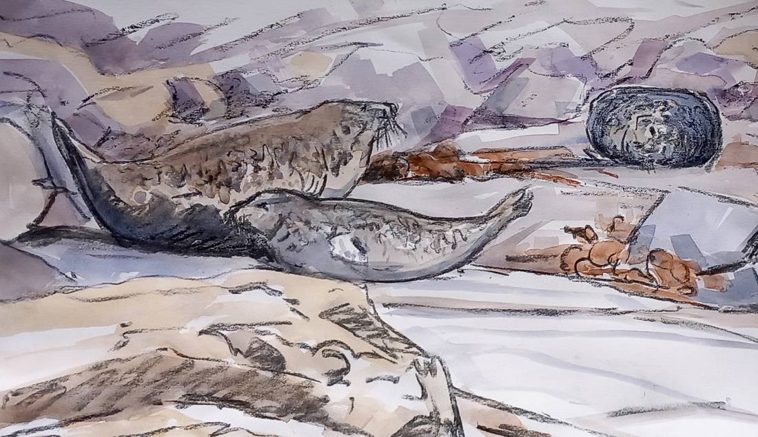
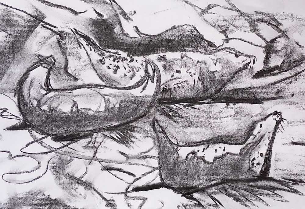
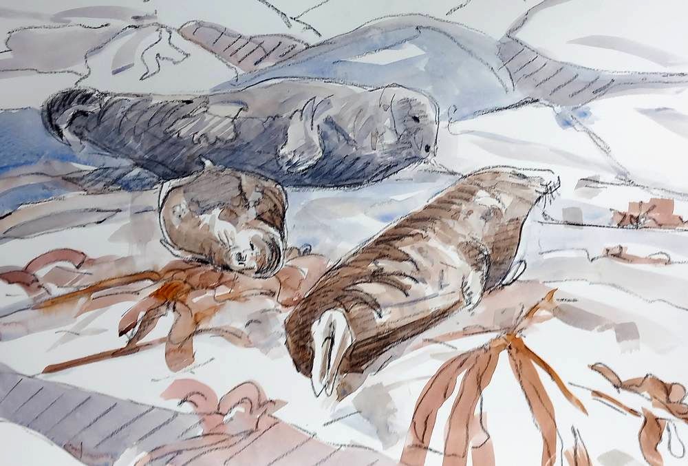
Charcoal seems well suited to depicting the bulk and weight of seals. These were a very active group on the foreshore of a well known haul-out, continually disturbed by each other and the rising tide. The third picture, below, drawn with pastel pencil, catches a brief moment of tranquillity.
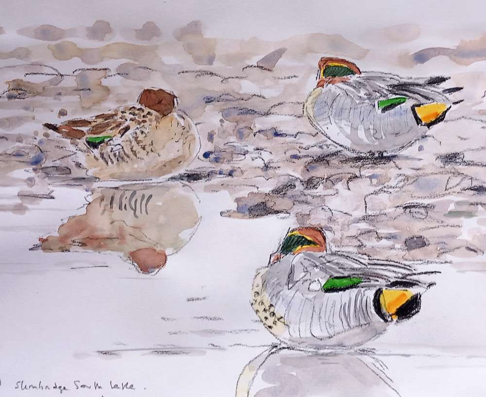
As I've confessed before, sleeping birds make great subjects. These teal made a very attractive still life composition.
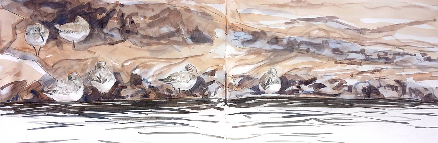
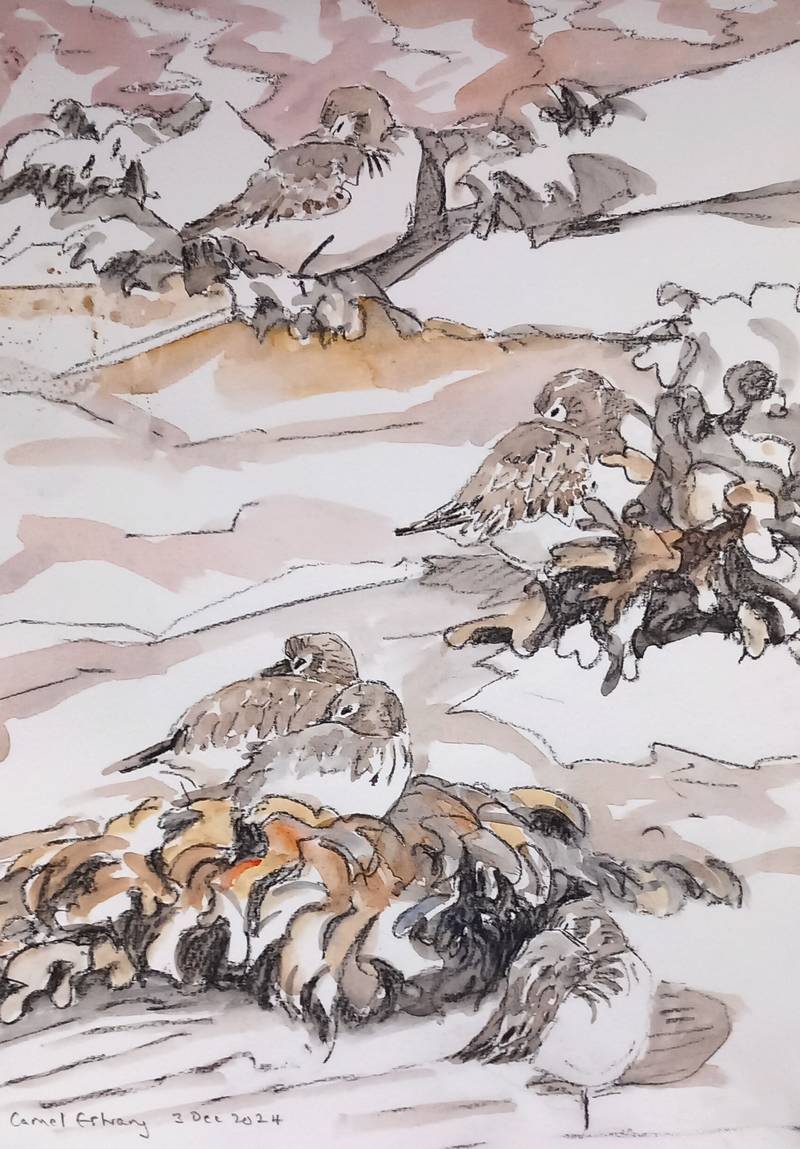
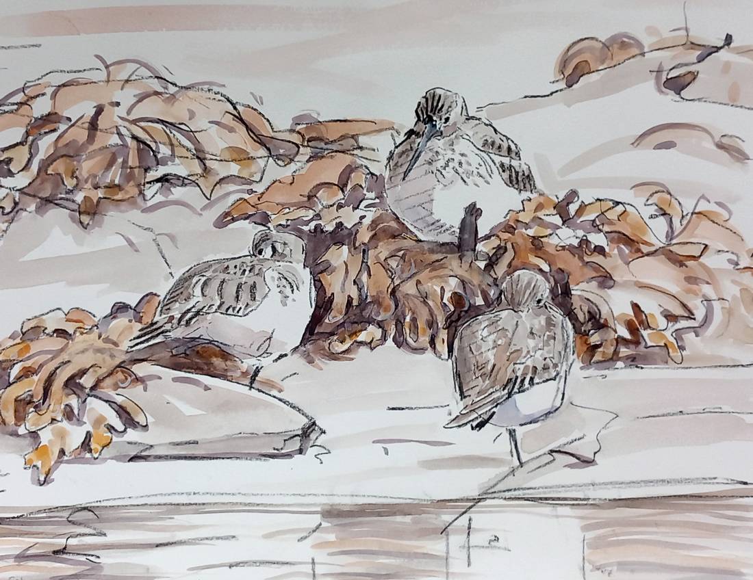
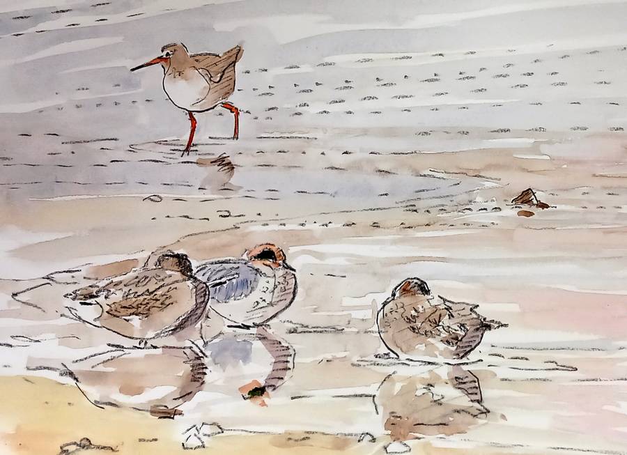
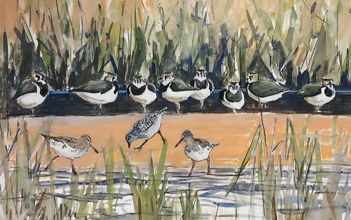
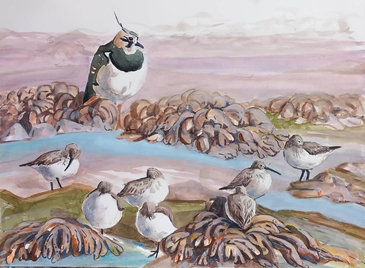
The rest of the sketches were done at the Camel Estuary in Cornwall. It has seemed a rather quiet autumn there, perhaps because the birds were often quite distant. I ended up drawing a lot of sleepy Dunlin, mostly because they offered the best opportunities, but also because they are lovely little birds, and make great subjects, whether scurrying around or puffed up spherical and asleep.
The next picture is a sketchbook double-spread. The Dunlin were lined up at the water's edge, sheltered by a bank of mud. But the tide was rising fast and they kept being pushed higher until there was no bank left... and then they were off.
The following little painting has not reproduced very well — it is rather pale and delicate in real life, but has a quality I like — the movement of water and Redshank against the sleeping forms of the ducks. And that little triangle of rock middle right seems to play an important role in the composition: put your fingertip over it and see what you think.
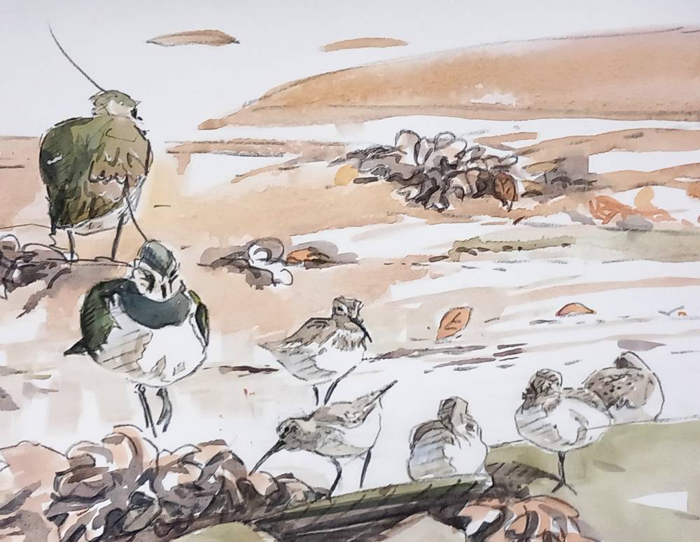
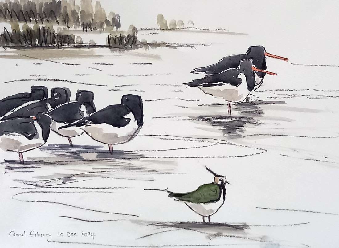
The rough Oystercatcher sketch below is a slightly odd picture with a graphic quality. It didn't come off at all as intended. The tide was rising fast and the birds kept moving and I was left trying to reconstruct from memory the arrangement that originally inspired me. The Lapwing is too small and could, perhaps, be a bit farther to the right. It's not a great sketch... yet, I find something pleasing about it. Perhaps it could be the basis for another picture.
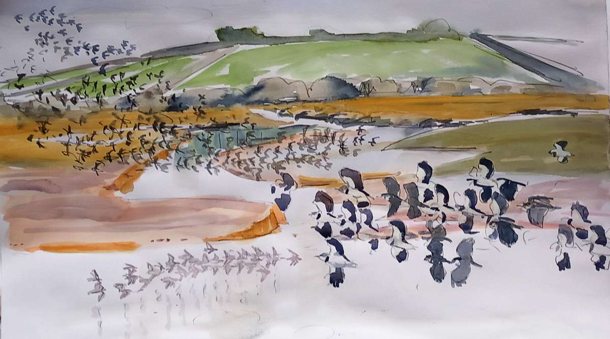
Although the estuary seemed quiet this autumn, at times that was simply because the birds were out of my sight. Now and again something would put all the waders in the air and suddenly the Golden Plover and Lapwings would be there in swirling flocks... before disappearing again!
I've just bought myself some gouache. I've been meaning to give it a go for ages. Here are a couple of preliminary efforts. These were both failed watercolour sketches. Rescuing failed watercolours is not how I intended (or intend) to use gouache, but it seemed a place to start playing with the opacity of the medium. Adding a bit of "body colour" to watercolour is a perfectly legitimate business (although the watercolour purists will certainly gasp in horror). However, it is best done in moderation for else it kills the freshness and luminosity of well-applied watercolour. These ones are more than half-way to being pure gouache! Neither picture is "finished" — they didn't seem to be going anywhere, so I gave up. They still make useful reference material.
This last one is interesting. To me it seems to have a slightly unreal quality about it. I can't quite pin it down and I can't quite decide whether I like it or not.